Sunday Funnies & The New Comics Kingdom – Thoughts

Some thoughts on scrolling through The Sunday Funnies on the new revised Comics Kingdom site.

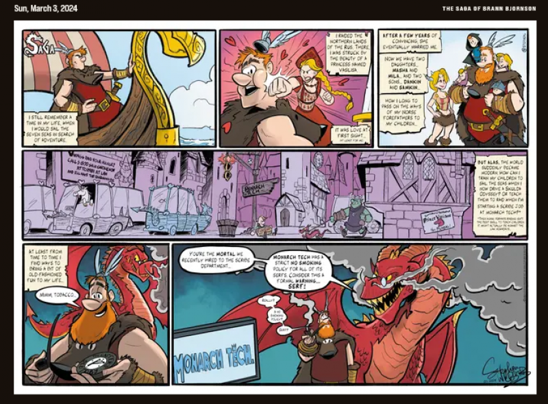
That gawdawful black background has gotta go. Or at the very least surround every comic with an eight inch (preferably a quarter inch) of white space a la The Saga of Brann Bjornson.

Too much clicking. To start my look I have to hit “Account” before I can click on “Favorites.” The old site had “Favorites on the opening screen. This may sound like a minor annoyance, but multiply that extra click by a hundred as you go through the site and it wears on the nerves.

Good News! Sally Forth, Daddy Daze, Rhymes With Orange, Macanudo, and Arctic Circle title panels are displayed. They all feature new art every Sunday and I’m grateful to be seeing them without searching.

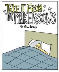
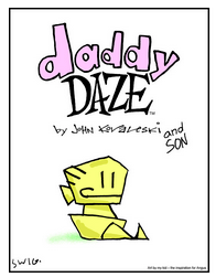
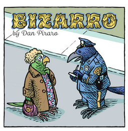
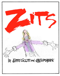
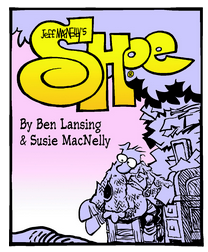
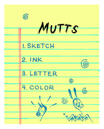
Bad News: Zits, Bizarro, Mutts, Carpe Diem, Take It From The Tinkersons, Daddy Daze, and other title panels that feature new art remain missing (and the Shoe title panel that used to be shown has now disappeared). Denying the reading public and especially paying customers any bit of the artistic talents of Jim Borgman and Dan Piraro is criminal.

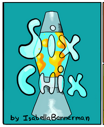
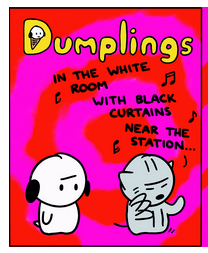
Then there is the meanness factor when I am denied a pleasant valley Sunday by disallowing a couple good memories from some virtual time traveling via the missing Six Chix and Dumplings title panels.

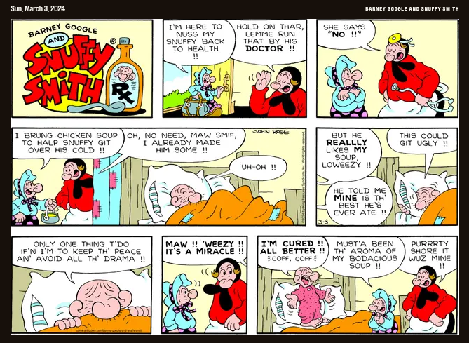
Good News! Hi and Lois, Barney Google and Snuffy Smith, Hagar the Horrible, Beetle Bailey, Blondie, and The Phantom are presented in half page format! That means we see the whole strip including the title panels. Most are standard and unchanging but The Phantom title panel changes as the stories change and the Barney Google and Snuffy Smith title panel changes every week.

Same old song and dance: I can’t believe the cartoonists are happy about the black background cutting that close to the comic strips. It destroys the ambiance. But at least the Sunday strip strips don’t have those ugly black stripes running up and down through them like the daily strips do.

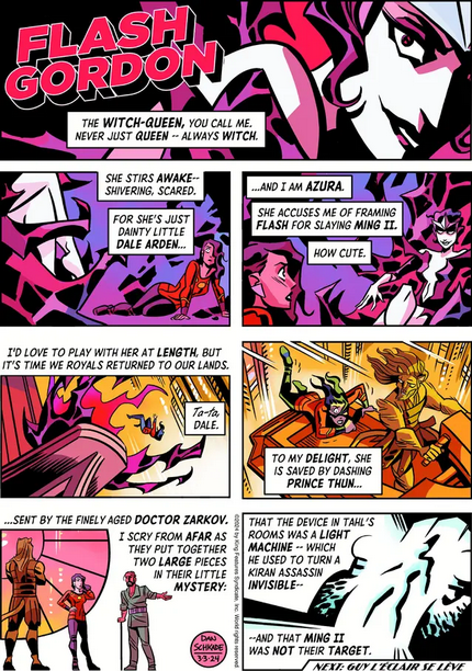
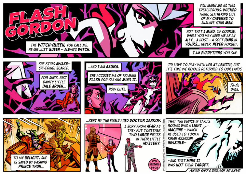
Bad news: Dennis the Menace didn’t go half page and Flash Gordon went from half page format to quarter page and/or tab format, cutting off a third of the title panel.

I checked to see if the half page version was at the “buy a print” page (it wasn’t) and found some good news – clicking on “buy a print of this comic” at the lower right automatically opens into a new page! Bad news: clicking on the comic’s title at the upper right doesn’t, taking you away from the original page.

Bringing me back to pleasant memories …

The Sunday Tiger has been truncated.
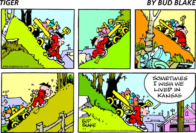
Instead of…

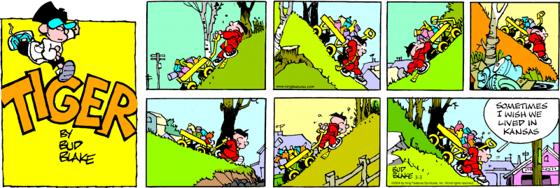
The memory goes back to the short version is how I read the Sunday Tiger in the weekly Grit, though in black and white and the Tiger logo placed, usually, at the first intersection of gutters. Imagine the title of the comic book below shrunk down to a correct proportion and put in the strip. Good times, though I’m still not happy about getting the Reader’s Digest version of this or the other strips.

Among those extra clicks I mentioned at the beginning of this rant is supersizing Prince Valiant to get a good look at Thomas Yeates’ art. At the old Comics Kingdom one could click on the image to embiggen. Now we have to click on “buy a print” and then click again to get the giant-size Val.

Hey! Give me my favorites on one smooth scroll without having to click to see more three times or more.

Leave the “click to add more” button for viewing the previous day’s strips.

And where are my vintage favorites??!!

That’s it for now other than, and apologies to the designer, I can’t believe King paid someone for that new logo.

29 thoughts on “Sunday Funnies & The New Comics Kingdom – Thoughts

  1. This is what happens when you try and reinvent the wheel and it turns out that it won’t roll anymore after they got done “re-inventing”. She was too cool for school. I listened to the podcast and it was clear she was trying to “update” and “fix” things. She probably never even looked at other comics sites (like GoComics.com) and how they work/look.

    The real question…will King Features fix this? Or will this be a “well we paid for it” and we can’t ask her to correct her errors, because, well, “it will offend the artist (the designer of the new site).” Well, too bad, she needs to correct her art, it sucks.

    They need to and quickly or they will lose even more subscribers (and revenue that helps pay for the comics and their creators who can’t be in a newspaper anymore because of the myopic cheapness of publishers like Gannett). Losing subscribers isn’t on the comics creators, that would be on King.

  2. All they had to do is copy the GoComics format in some way, tweaking it along the way to make it their own.

    1. Really, all they had to do was go back to their “DailyINK” format. It was simple and worked fine. That’s all I need to read their comics and don’t mind paying for that. I DO mind paying for an over-designed, bloated, not-well-working site designed by people who seem to have more of a background reading Web comics rather that a history of reading comic strips originally developed for newspapers.

  3. (suggestion (for an editor of this site): check paragraph directly “Barney Google and Snuffy Smith” image on this page)

  4. If you have any contacts at CK, please ask them if they are going to un-trash the vintage strips.

      1. Thanks.
        I had comics sent to email even though I rarely used it. I looked at the site daily.

        I had a couple emails in my trash before the Great Improvement and used those to find where I left off for TT, Buz, Johnny Hazard, and Judge Parker. Not for Radio Patrol and maybe one or two others.

        So far, none of those are being advanced on the site.

  5. Kingdom has always had layout problems for me on its login page on two different iPads. with Safari. The spot to touch to log in was nowhere near where it said “login”. The new page is even worse and only displays on the newest iPad. Blank screen on the older model. The only way I can read my favorites on that device is with the emailed version. They’ll probably break that next.

  6. ‘To start my look I have to hit “Account” before I can click on “Favorites.”’

    Bookmark https://comicskingdom.com/favorites – if they log you out this might add a click to log back in, otherwise you go straight to your favorites. (I’m getting 15 at a time on Favorites, not 3, but I’m using my new free account.)

  7. From what I can tell, the issue with vintage strips not appearing with your favorites is that the vintage strips carry their original dates, and therefore the site doesn’t consider them “today’s” comics. (There appears to be no real concept of a daily comics page on the redesigned site, just a presentation of your favorite strips in strict chronological order.)

    “Krazy Kat” is saved as one of my favorites, and if I switch from “newest” to “oldest,” my favorites feed starts with 1922-dated “Krazy Kat” strips.

  8. So the way I see it is this: It used to be $19.99 a year to see all the contemporary plus vintage comics you wanted. Now you can either get a free account to see contemporary cartoons or pay $49.99 to add vintage comics.

    Only you won’t actually get the vintage comics unless you hunt them down one at a time.

    Makes perfect sense to me.

    (I’m glad I’m not the person who filed all the vintage comics by original dates rather than run dates. A lot of re-editing if they want this thing to work.)

    1. And, they are still missing a bunch. For nearly $50 a year, they better add a whole bunch of vintage strips. Like Steve Roper & Mike Nomad (hint hint).

      They also lost all of the older Rex Morgan strips. It only goes back to 2019?!?

      They need to get it together. My renewal is in June. Figure it out, KFS.

      ps- why didn’t they just design it like you were the Editor and making your own comics section/page? You know, like your own newspaper.

  9. My biggest complaint with the new design is the fact that I cannot start with a week ago if I miss a week. I have to scroll, click “Add more comics”, and repeat until I get to the comics from 7 days ago, then read scrolling up.

  10. No more vintage Apartment 3G. I have to go back to the original year and day to pick up the story where it left off on the old site.

  11. I am annoyed that the new design still doesn’t let you comment on a strip without setting up a separate account. It is a clunky and unnecessary feature that should have been removed.
    If you click “All Comics” you only get text. There is no way of judging the appearance of the comic from a thumbnail before clicking on it. The thumbnail on the comics’ page appears to be an excerpt from a strip. It’s confusing.

    On February 29 I got the comics for March 7 when I logged onto the site. This has been corrected.
    I don’t have a problem with the black backgrounds.

    1. My problem with the black background is it bleeding into the comics’ borders.
      Give the strip some breathing room.

      Also, while scrolling through today’s favorites, I noticed that the miniscule comic title at the far upper right doesn’t cut it. I came onto the new Suburban Fairy Tales and thought, “What is this?” Think about new readers having to check what comic strip they are reading.
      Every comic at the new Comics Kingdom should be set up with something akin to Zippy the Pinhead.
      https://comicskingdom.com/zippy-the-pinhead/2024-03-04
      Like newspapers the comic has its title and creator credit plainly visible heading the strip.

  12. Ironically for an effort to bring the site up to date, the contemporary Mandrake The Magician, the story arc of which has Lothar fighting heroically (and eloquently) to save Mandrake’s life, was replaced in my emails right at the climax with the vintage Mandrake, where Lothar speaks pidgin English.

    As of this morning, they can’t seem to find vintage Judge Parker strips again. Good to see that some things haven’t changed. lol

  13. I think it would be a great idea if all the comments here were forwarded to someone in charge at King. I hadn’t heard about a price hike associated with this, one involving the vintage strips. From reading comments here and on Facebook, I don’t recall seeing any remarks praising the new site. It seems just about everyone is unhappy.

  14. It is still unreadable for many comics, the new over-display graphics block out large parts of the comic, often the punchline or important parts.

  15. I just went to my favorites, and it looks like they’ve added more navigation to the page. Nice to see they’re adopting some of our feedback.

  16. My guess is this redesign is an effort by CK to reduce costs by driving away online viewers/customers. This allows them to severely decrease or eliminate their online presence, thus engender more profits for the Board of Directors of CK.

    I just signed up with Comics Kingdom. I will be closing that account immediately.

    1. No that’s not it. The three responsible for the change really believe in what they are doing and don’t seem to care that they have gotten a momentous amount of criticism. Much like the Web narcissists that believe themselves to be “influencers”, they present as though they know better than their customers do and therefore have no need to reverse course. They will only continue to provide “fixes” until the next people in the positions want to “fix” things all over again.

  17. OK, report on the current state of CK (I have both paid and free subscriptions under different email addresses):

    Favorites (16) appear as a single page of today’s. Yesterday (and in the paid case Peek At Tomorrow) link available, as well as pulldowns to choose other year month day, for the entire page. No date change available for individual comics on the Favorites page. Older strips remain available to free subscription.

    They seem to have fixed most (but not all) of the problems at launch. Think of how much money they saved (and goodwill they lost) by not hiring a user experience expert to supervise a beta test with a few current subscribers!

    1. I should have mentioned that the paid subscription delivers Favorites about 1/3 larger than does the free subscription. Still not worth $50/year.

Comments are closed.

Top