Michael Ramirez Cartoons – Fit For Print?

Let’s get this straight right off the bat: this is not a political post.

As most of you know Michael Ramirez is the Pulitzer Prize-winning, Reuben Award-winning editorial cartoonist for The Las Vegas Review-Journal with a conservative outlook. But again forget the politics, this is about his art.

And one would be hard-pressed to argue that Michael’s cartooning is not art. But is he getting too artsy for print?

A few weeks ago Mike included a Ramirez cartoon in a column that confused a number of us because the point of it was lost amongst all the impressive line work.

And that was a full color high-resolution drawing for people reading it on their computer. Imagine trying to get the point when reading it on your local paper’s opinion page. Well, I don’t have to imagine, that is my reality.

My local broadsheet gets their political cartoons from Creators Syndicate and the paper definitely leans right, so Michael is part of the regular rotation.

Now some Ramirez cartoons are fine for pulpy paper printed in black and white, but every other or third cartoon has Michael going intensive with his drawing. Then there is a problem.

The past week had my newspaper run two Ramirez commentaries, both came out very “muddy.”

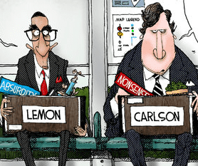
Today the paper ran this one (we are near the Bay Area):

A lush scene with palm trees and flora (in the middle of a desert, but that’s not what this is about).

Here it is from my newspaper:

All the detail is gone.

A few days ago we were treated to this cartoon:

And in the paper:

The ornate door virtually disappears while the portraits are barely discernible.

In Michael’s defense the newsprint cartoons are taken with a handheld phone camera which blurs it some, but not a lot. Michael does makes sure the word balloons are clear and with a white background.

I don’t know if The Review-Journal prints them in color or not, or if they have better presses (probably).

Now I’d think that Michael’s cartoons get more eyeballs from the world wide web than from print where all those exceptional lines and colors come through, but are at least a third of his cartoons are making it hard on the dead tree editions.

The cartoons are © Las Vegas Review-Journal/Creators/Michael Ramirez

7 thoughts on “Michael Ramirez Cartoons – Fit For Print?

  1. I’m not a big fan of Michael Ramirez — not because I’m opposed to hearing other people’s opinions; I just never find him very insightful or witty.
    That said, I did laugh at the “identifies as beer” label on the Bud Light kegs. It ain’t beer.
    And maybe I’m missing something by not living in his local area. The “Vegas already has a minor league team” joke was pretty funny, if very sad, since it comes at the expense of a once-great franchise.

    1. Bob-
      The operative word in editorial cartooning is “editorial”. The thrust of an editorial cartoon is (or should be) making a serious point and doing so through satire. The objective is to make an editorial point and make the reader think. Getting a laugh is a bonus. If an editorial cartoon just goes for a gag, using a current issue as a vehicle and doesn’t make a point about that issue, then the cartoon and the cartoonist has failed.

  2. My local paper, the Eau Claire Leader-Telegram, prints its Ramirez cartoons (their selection spans the political spectrum) in color. But the color registration is not always correct, and their black plate tends to run the gamut of gray scales as well, so the overall picture is distinctly less impressive on the page than online. It never bothers me much since his message is usually totally wrong, but still, it seems like the problem that digital clarity rarely is reflected in printed papers is likely turning off new subscribers to physical newspapers, if indeed, such a breed still exists.

    By the way, Ramirez, nearly every major league team that has ever moved to a new city has been either the worst team in the league or the one with the lowest attendance. THAT’S WHY THEY MOVE. The status of being a major league city is the point here, if you can’t see it. I suspect this was just a day when he couldn’t find something more worthy of bitching about.

  3. We have the same problem in the Wash Post which prints their contract cartoonist Michael de Adder small and in black and white. It’s hard to see why they bother about 1/2 the time.

  4. I am currently colorist for 8 syndicated features and I can add to the discussion the fact that the specific color choices being made here also affect the outcome. When I am working with screens or a lot of cross hatching or other dense line work I must choose the lightest colors I can when possible so that the line work of the cartoonist will show through. The color here is beautiful but quite dark and that darkness intensifies when A) the art is compressed for print and B) there is no illumination from behind via computer/phone screen.

    Also of possible interest is the fact that how the color is converted to gray scale makes a big difference – if the cartoonist is not preparing a BW version themselves they are at the mercy of whatever production team member makes the adaptation.

    1. Anne – Thanks for chiming in. There’s a lot of lost knowledge about the middle ground nuances of pre press work as it once was. I’m not saying that everyone should have had the benefit of cutting rubylith and discussions with experienced pressmen (press persons, sorry), but when the artist knew about print parameters like dot gain, over saturation, etc. they drew to those limitations. If the art wasn’t rugged enough to survive newsprint repro it turned out fugly. That’s what is happening to Mike Ramirez’s art. Now get back to work!

  5. A huge part of it is that they’re printing the color cartoons in black & white. Ramirez at least used to have a color and black & white choice for those reprinting his work. Sometimes the b&w was chosen, where the color inks weren’t there at all, just the line work and pattern gray tones. And most papers that reprinted cartoons in color could chose ones like those above. I never see the non-color ones anywhere anymore these days.

Comments are closed.

Top