Wayback Whensday: Origins of the Color in Comics
Skip to comments
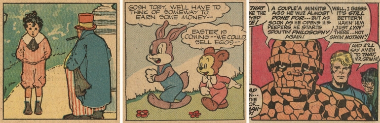
True Grit Texture Supply provides us with Guy Lawley’s history of the development of color in the Sunday Color Supplement and the comic books of the 20th Century in The Origins of Vintage Comics.
Just about every illustrator on the planet has a soft spot for the warm, nostalgic aesthetic of vintage comics. The visible dot patterns, uneven, mis-registered print and cheap newspaper stock offer a stark contrast to modern offset printed comics and graphic novels. For all the love the aesthetic gets, few of us know how vintage comics came to look this way, or what technologies were used to print them.
Comics historian Guy Lawley has spent years tracing that history. In part one of this two-part series, he’ll take you on a fascinating deep dive into the newspaper industry’s color printing arms race, the surprising origins of the speech balloon and an introduction to the comic color systems used by craftspeople who never set foot near a computer.
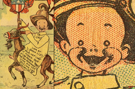
The color presses used for the Sunday comics developed from the original ‘web rotary’ newspaper presses, first built by the Richard M. Hoe company in 1870, specifically to print black text on newsprint at phenomenal speed…
Printing illustrations on these super-fast industrial machines, designed for text, was highly challenging. In 1883 Joseph Pulitzer’s New York World overcame the difficulties and introduced regular cartoons and illustrations, limited to black-and-white line drawings.
In 1890, in Paris, France, a printing press manufacturer named Hippolyte Marinoni, who also owned a newspaper, built the first successful four-color rotary. Adding extra cylinder pairs to print red, blue and yellow was a major technical feat, especially getting four plates to print in reasonable alignment with each other — ‘in register’ — not an issue when printing only in black. Marinoni printed a weekly color supplement for his daily paper le Petit Journal (‘the little paper’) — 8 pages with color front and back covers — soon reported to be selling an unprecedented million copies a week.
Publishers abroad took notice…
While waiting for Part Two check out the other sources Lawley recommends in his notes:
[7] I recommend coming back here for Part 2, which will be an informative summing up of a great deal of fascinating stuff… but if you can’t wait, these three sources have accurate material: my blog — a good jumping-on point is: BEN DAY DOTS Part 9a: 1950s and 60s — the ‘Silver Age’ of comics, Part 1 | LEGION of ANDY; plus: A Brief and Broad History of Post Golden Age-Pre-Digital Comic Book Coloring by Sarah on Medium; and Marvel Behind The Scenes – Beyond The Behind*! Chemical Color Plate | Eliot R. Brown.com.


Comments 4
Comments are closed.