Comic Strips

Free Range Funnies

It may just be my imagination but…

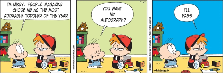
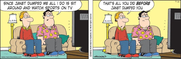
Did Tom Armstrong go to slightly different lettering for Marvin this week?

Also new!
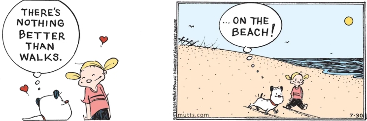
For only the third time this year we have a new MUTTS comic strip!

The John Hart Studio is playing with the format.
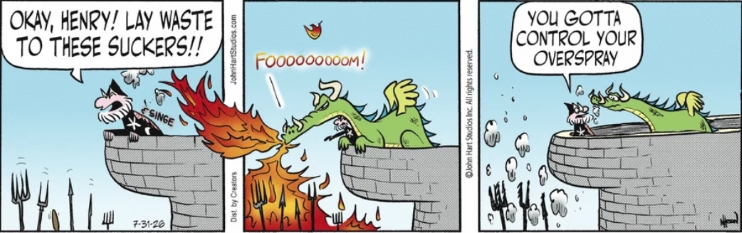
The Wizard of Id makes hay with the time-space continuum.

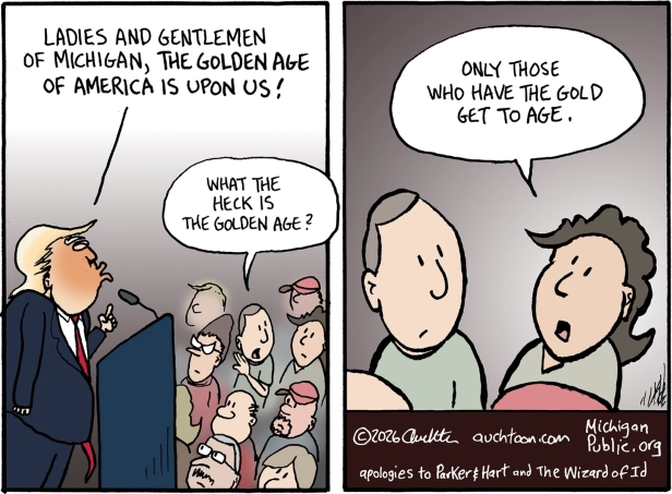
While still with the Wiz of id… Earlier this week Mike Peterson featured a couple tribute cartoons in his Comic Strip of the Day column. One that didn’t show up there was by John Auchter:
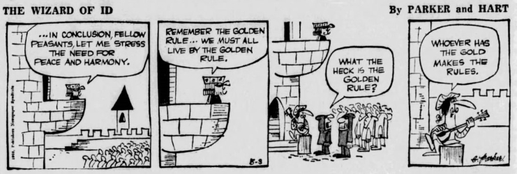
Wizard of Id by Brant Parker and Johnny Hart – May 3, 1965

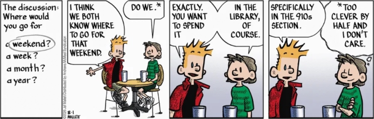
Frazz reminds me that it has been quite awhile since I checked in with the Lexington Public Library.
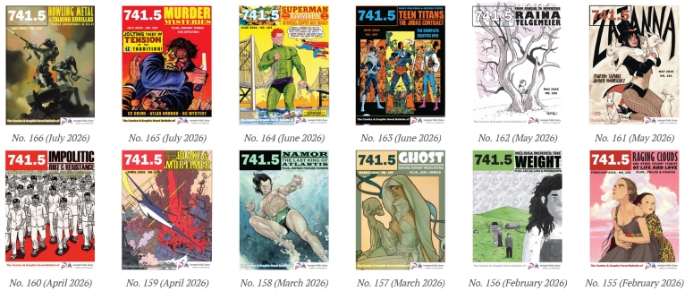
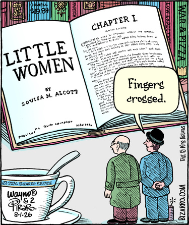
Still with the bookshelves – until I’m told different I taking that middle “Partch” book to be a collection of Virgil (VIP) Partch cartoons. And Saturday’s WaynoBlog did nothing to dissuade me.
Previous Post
CSotD: The Emperor’s Nude Clothes
Next Post
The 10 Artists that Influenced Bob Staake
Cartoonists's Cartoonists: Bob Staake

Comments 4

  1. Marvin most definitely has the same style of text in both cartoons. It’s typed in both, but I think the text is at a slightly different size.

    1. I agree. Looks like the same typeface, just one or two points larger with tighter leading (space between the lines). Probably trying to squeeze bigger letters into the same sized balloons.

  2. I was too busy looking for the joke to notice the style. So few actual funnies in the funnies.

  3. Ah, yes, I was referencing VIP. I’d kind of forgotten about the joke spines when I wrote the blog.

    In the strip layout of that gag, there’s a spine partial view of a spine. The visible text reads “ERE • Partch,” so I was thinking of his early book of cartoons, “It’s Hot In Here.”

Comments are closed.

Search

Subscribe to our newsletter

Get a daily recap of the news posted each day.